I'm going to continue blogging but not here. New blog: http://cortneyparsons.wordpress.com/
Thursday, May 17, 2012
Wednesday, May 9, 2012
Final Course Summary
Throughout this semester,
I was able to acquire a lot of knowledge from Digital File Preparation that I
know will be beneficial to me in the future. Prior to taking this class I
wasn’t really even aware that there was a right and a wrong way to prepare a
file, I was mainly just interested in whether or not the design was
aesthetically appealing. While I still think the aesthetics of a design are
tremendously important, I now realize that if the file isn’t prepared correctly,
and as a result doesn’t print the way it was intended, it doesn’t matter how
well it is designed. So the main takeaway for me from this class was that the
design and preparation aspect are of equal importance, every project must have
both to be effective.
Additionally, I was able
to improve my proficiency in InDesign, Photoshop, and Illustrator through
working on the various projects over the course of the semester. I really
enjoyed all the projects we completed, though I wish design could have been
more of an emphasis. I understand that the course is structured to focus on
file preparation but just as a design is useless if not prepared well, a well
prepared file is useless if not designed well.
Overall, I really liked
this class. I feel like I was challenged and learned a lot from it.
Wednesday, May 2, 2012
Adobe Tutorial: How to Replace the Sky in a Photo
Step 1: Select all of the original photo (command + A) and copy it.
Step 2: Paste it into the replacement sky document window. The original photo is now on its own layer (layer 1) and will be blocking the replacement sky photo.
Step 3: Duplicate the original photo (command + J)
Step 4: Remove the visibility of the top layer (the duplicated original photo) by clicking on the visibility icon to the far left of the layer's preview thumbnail.
Step 5: Click on layer one to make it the active layer.
Step 6: Select the area of the original photo you want to protect by using one of the lasso tools or the quick selection tool.
Step 7: Once you have the area selected you want to protect, convert the selection to a layer mask by clicking on the layer mask icon at the bottom of the Layers Panel.
Step 8: Turn on the visibility of the top layer.
Step 9: Double click on the layer's preview thumbnail. This will open the Layer Style dialog box Blending Options. In the Advanced Blending section, change the Blend If option to Blue.
Step 10: On the This Layer slider bar, drag the right slider to the left. This will cause the sky in the original photo will to disappear, keep dragging until most of it is gone.
Step 11: Hold option (or alt for windows) on your key board and click on the slider and keep dragging toward the left. This will split the slider into two. Now you can adjust them independently of each other. Adjust the sliders until you are happy with the result, then click okay to complete the sky replacement.
sources:
http://www.photoshopessentials.com/photo-editing/replace-sky/
Photos were downloaded from flickr.com creative commons
Step 2: Paste it into the replacement sky document window. The original photo is now on its own layer (layer 1) and will be blocking the replacement sky photo.
Step 3: Duplicate the original photo (command + J)
Step 4: Remove the visibility of the top layer (the duplicated original photo) by clicking on the visibility icon to the far left of the layer's preview thumbnail.
Step 5: Click on layer one to make it the active layer.
Step 6: Select the area of the original photo you want to protect by using one of the lasso tools or the quick selection tool.
Step 7: Once you have the area selected you want to protect, convert the selection to a layer mask by clicking on the layer mask icon at the bottom of the Layers Panel.
Step 8: Turn on the visibility of the top layer.
Step 9: Double click on the layer's preview thumbnail. This will open the Layer Style dialog box Blending Options. In the Advanced Blending section, change the Blend If option to Blue.
Step 10: On the This Layer slider bar, drag the right slider to the left. This will cause the sky in the original photo will to disappear, keep dragging until most of it is gone.
Step 11: Hold option (or alt for windows) on your key board and click on the slider and keep dragging toward the left. This will split the slider into two. Now you can adjust them independently of each other. Adjust the sliders until you are happy with the result, then click okay to complete the sky replacement.
 |
| replacement sky |
 |
| original photo |
 |
| final result |
sources:
http://www.photoshopessentials.com/photo-editing/replace-sky/
Photos were downloaded from flickr.com creative commons
Sunday, April 22, 2012
Job Search Analysis 3
Junior Creative
Designer
The Junior Creative
Designer will primarily provide assistance to the creative team designers on a
variety of different projects (brand promotions, packaging development, online
and print advertisements, etc.) to ensure the projects are both accurate and
completed by the scheduled deadline. Responsibilities of this position are
project planning, development, management, and execution; assisting with the
management of all print and online materials, including updates and revisions;
maintain consistency throughout all the brand properties as well as give
strategic suggestions to improve products and brand presence; assists as the
contact to outside vendors and other departments; good understanding of digital
media, branding, and interactive design; and contributes to other
communications and related assignment as needed.
Education Requirement: Bachelor’s degree in Graphic Design, Visual
Communication, or comparable study.
Preferred Skills &
Software:
·
Experience in
creating print documents, pre-press to press checks.
·
Adobe CS:
Photoshop, InDesign, Illustrator, etc.; Microsoft Office: Excel, Outlook, Word, Powerpoint.
·
Video editing,
HTML, and social media experience is preferred.
·
Exceptional
communication, organizational, and management skills.
·
Self-motivated,
problem-solver
Salary Range: The salary range for a Designer (print, web, and
interactive) is $40,000 to $55,000.
Years of Experience: Entry-level position
Thursday, April 19, 2012
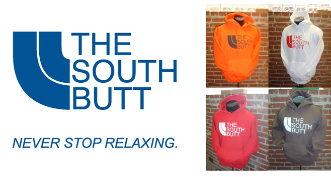
Lawsuit Article Review
The North Face Apparel
Corporation vs. The South Butt LLC
In December of 2009, The
North Face Apparel Corp. filed a lawsuit against the The South Butt LLC—a
parody apparel line created by University of Missouri student Jimmy Winkelmann.
The North Face filed the lawsuit based on allegations that The South Butt was
“marketing apparel that directly and unabashedly infringes and dilutes The
North Face’s famous trademarks and duplicates The North Face’s trade dress in
its iconic Denali jacket.” The South Butt was created as a parody of The North
Face. Its brand identity (logo, tag line, apparel, etc.) is remarkably similar,
if not exactly the same, as The North Face. Does piracy under the assertion
of parody make it okay? The lawsuit was settled in
April of 2010. However, the terms of the settlement agreement were not
disclosed.


Article sources:
Image sources:
Job Search Analysis: Position 2
RELEVANT Magazine: Designer
Job Description: The Designer position is involved in a vast range
of design projects. These projects include: magazine and book design, marketing
campaigns, content-driven website design, story graphics, client projects, and
beyond. Print is the foundation at RELEVANT, however digital media also plays a
significant role in what we do. Therefore, a versatile designer who has
experience in both print and web are preferred. The ideal candidate filling
this position is a creative, big picture thinker and problem solver who stays
current with the latest design trends and has an exceptional ability to
self-manage.
Education Requirement: Degree in graphic design or equivalent experience
Preferred skills &
software:
·
Proficiency in
Adobe InDesign, Photoshop, and Illustrator is required
·
Experience in
editorial and marketing design and motion and digital design
·
Able to
multitask, meet deadlines, and work in a team environment
·
Knowledgeable
about typography
·
Interest in
RELEVANT’s audience and subject matter
Salary Range: The salary range for a Designer (print, web, and
interactive) is $40,000 to $55,000.
Experience: 1+ year of agency or media experience
Sources:
Monday, April 16, 2012
Adobe Software Tutorial
Photoshop: Quick HDR Effect
Steps:
Step 1: Duplicate the original image.
Step 2: Name the copy Shadows/Highlights. Go to Image > Adjustments > Shadows/Highlights. Set the Shadows and Highlights amount to 50%.
Step 3: Duplicate the layer and name the copy Desaturate. Go to Image > Adjustments > Desaturate. Then change the layer blending mode to Hard Light.
Step 4: Duplicate the original image and name the copy Blur. Go to Filter > Blur > Gaussian Blur and set the radius to 40 pixels. Then move the layer on top of the other layers and set the layer blending mode to Soft Light.
Step 5: Flatten the image and save.
Source: http://www.icanbecreative.com/quick-hdr-effect-photoshop-cs5-tutorial.html
(image was taken by me.)
 |
| Start Image |
 | ||||
| End Image |
Steps:
Step 1: Duplicate the original image.
Step 2: Name the copy Shadows/Highlights. Go to Image > Adjustments > Shadows/Highlights. Set the Shadows and Highlights amount to 50%.
Step 3: Duplicate the layer and name the copy Desaturate. Go to Image > Adjustments > Desaturate. Then change the layer blending mode to Hard Light.
Step 4: Duplicate the original image and name the copy Blur. Go to Filter > Blur > Gaussian Blur and set the radius to 40 pixels. Then move the layer on top of the other layers and set the layer blending mode to Soft Light.
Step 5: Flatten the image and save.
Source: http://www.icanbecreative.com/quick-hdr-effect-photoshop-cs5-tutorial.html
(image was taken by me.)
Thursday, April 12, 2012
Job Search Analysis: Position 1
Graphic Designer/Marketing Coordinator
Job Description:
The Graphic Designer/Marketing Coordinator assists
with the development and implementation of marketing/advertising initiatives by
designing, planning, and producing graphics for copy, advertising, online,
mailers, newsletters, multimedia presentations, and other printed materials.
Regularly coordinates with various outside vendors to complete projects.
Maintains, tracks, and replenishes promotional materials. Prepares marketing
reports. Collaborates with CRM to maintain and analyze databases.
Education Requirements:
Bachelor’s Degree
Preferred skills & software:
Applicant must be proficient in Adobe CS5
(Photoshop, Illustrator, InDesign,); Microsoft Office products; and some social
networking tools. Familiarity with web design coding (CSS, HTML) and knowledge
of pre-press procedures is preferred. Close attention to detail. Exceptional
organizational and interpersonal skills. Able to manage several projects and
project deadlines simultaneously.
Salary Range:
On average, a Graphic Designer/Marketing Coordinator
earns a salary of $38,000. However, this range varies significantly with
location, experience, industry, company, and the like.
Years of Experience:
2+ to 5 years of experience. A minimum of 3 years
work experience, as a graphic designer, is preferred.
Sources:
Wednesday, April 11, 2012
Final Project
Bulletin:
The price to produce 500 bulletins is $32.43.
The purpose of the bulletin is to inform
individuals who attend Sunday service about the service, church activities, etc. Therefore, the target audience is people attending the church on any given Sunday. Considering the content that appears in the bulletin will vary, the call to action will change from week to week depending on the individual (i.e., member or visitor) and the church activities.
Project Specifications:
Project Specifications:
- Trim size: 8 in. x 11 in.
- Margins: .25 in.
- Bleed: .125 in.
- Folded (folds to 5.5 in. x 4.5 in.)
- Black and White
- Master Image List items: Vector Image
The price to produce 500 bulletins is $32.43.
Brochure:
The purpose of the bulletin is to create awareness for the First Baptist Church of Girard and inform them about the church's ministries. The target audience is individuals who are seeking a church to attend, with the call to action being to visit the church.
Project Specifications:
The price to produce 500 brochures is $261.37.
The purpose of the bulletin is to create awareness for the First Baptist Church of Girard and inform them about the church's ministries. The target audience is individuals who are seeking a church to attend, with the call to action being to visit the church.
Project Specifications:
- Trim Size: 16 in. x 5 in.
- Margins: .25 in.
- Bleed: .125 in.
- Folded (folds to 4 in. x 5 in.)
- Color
- Master Image List items: 4 Color Raster (2), Duotone Raster, Vector Image
The price to produce 500 brochures is $261.37.
 |
| Bulletin Thumbs |
 |
| Bulletin Rough 1 - outside |
 |
| Bulletin Rough 1 - inside |
 |
| Bulletin Rough 2 - outside |
 |
| Bulletin Rough 2 - inside |
 |
| Brochure Thumbs |
 |
| Brochure Rough 1 |
 |
| Brochure Rough 2 |
 |
| Brochure Folding Dummy |
 |
| Bulletin Folding Dummy |
 |
| Brochure - Front (right); Back (left) |
 |
| Brochure - Inside |
 |
| Bulletin - Front |
 |
| Bulletin - Front and Back |
 |
| Bulletin - Inside |
Copyright:
The First Baptist Church logo used in the bulletin and brochure was created by me in Illustrator.
The raster images in the brochure were free downloads from creativeswap.com.
All other elements, in both the bulletin and brochure, were generated by me using Photoshop and InDesign.
Wednesday, April 4, 2012
Adobe Tutorial
Selective Coloring Effect in Photoshop
Step 1: Quick selection tool to select the basketball.
Step 2: Invert the selection (Select > Inverse).
Step 3: New adjustment layer (from icon in the Layers Panel), select Black & White.
 |
| Before |
 |
| After |
Step 1: Quick selection tool to select the basketball.
Step 2: Invert the selection (Select > Inverse).
Step 3: New adjustment layer (from icon in the Layers Panel), select Black & White.
Sources
Image: downloaded from flickr creative commons (http://www.flickr.com/photos/47611288@N00/3222971810/)
Monday, April 2, 2012
National Logo Redesign - JCPenney
Reason for the Rebrand:
Earlier this year JCPenney
unveiled a new logo design. In addition to the new logo, JCpenney announced (on
January 25, 2011) that they are performing a complete renovation of their
marketing strategy as well as their product line. JCPenney CEO Ron Johnson made
the following statement regarding this announcement: "The department store
is the number one opportunity in retail today. We are going to rethink every
aspect of our business, boldly pursue change, and create long-term shareholder
value, as we become America's favorite store. Every initiative we pursue will
be guided by our core value to treat customers as we would like to be treated -
fair and square. Beginning February 1, we will have Fair and Square Pricing,
making every day a great day to shop. We will create tremendous excitement
through monthly promotions that are in sync with the rhythm of our customers'
lives. And we will transform each and every jcpenney store over the next four
years with a month-by-month, shop-by-shop roll-out of exciting new merchandise
initiatives.” In recent years, JCPenney had experienced declining sales and
numerous store closing. This rebranding initiative is undoubtedly a response to
the department store’s recent struggles. The new logo looks to be an attempt to
modernize their look in hopes of increasing sales.
 |
| http://www.shoppingblog.com/2012pics/jcpenney_new_logo.jpg |
Characteristics of new logo:
According to JCPenney,
their new logo is intended to remind consumers of the American Flag and their
“commitment to treating customers Fair and Square.” Additionally, the imagery
of the square will play a significant role in the companies marketing
campaigns. As you can see in the picture to the right, the new logo consists of
a red square outline and a blue square in the top left hand corner with ‘jcp’
in white text. It’s a very simple, clean design that depicts a more
contemporary feel than their previous designs.
Implementation:
JCPenney began its
implementation process on February 1 with the unveiling of their new logo design
and announcement of the planned overhaul for their marketing strategy and
product line. In August of 2012, JCPenney will begin updating their stores
nation wide with their updated look and new merchandise. The implementation of
these new initiatives is expected to conclude by the end of 2015.
Opinion:
In my opinion, JCPenney
has been long overdo for a total transformation of their brand. The old
JCPenney logo didn’t elicit any sort of representation of the brand, which only
added to the confusion of their brand identity caused by the company’s overuse
of sales events. While the new logo design is moderately boring and not exactly
eye-catching, it has to potential to be effective. If JCPenney is able to
successfully employ their new marketing strategy and create the imagery they
desire with their new logo, it could become an exceptional representation of
the brand. In turn, creating a strong brand identity and clear positioning of
the company in the minds’ of consumers. As it seems, they are off to a good
start, since beginning the rebranding process the department store’s stock
value has increased and the outlook for 2012 is bright.
Thursday, March 29, 2012
Everyday Design Inspiration

From product to package design and everywhere in-between,
Apple without fail has designs that are not only aesthetically appealing but
also effective. The most notable aspect among all of Apple’s designs is their
simplicity. I really enjoy the beauty in simplicity, and Apple does an
exceptional job of exemplifying this idea.
Color: This display’s design, like the majority of Apple’s
designs, has a basic color scheme of black and white. The contrast of the black
background and white iPad2 text with the Apple logo is an attention grabber.
Typography: The typography used is a san serif typeface
(possibly Helvetica). I really like this font with the design because it adds
to and reinforces the overall simplicity. Additionally it is easy to read,
which will increase the likelihood of it being read.
Logo Design: Over the years, it has evolved to a simple
graphic only logo and is recognized across the world.
Target Audience: People who enjoy new, user-friendly
technology as well as professionals.
Call to action: Buy the iPad 2.

Color: The color scheme used is: light brown, black, light
blue, and white. There are also various color photos on the side of children
receiving TOMS. The use of neutral colors (brown, black, white) allows for the
logo to become the main focal point of the design.
Typography: I really like the different weights used for the
font, drawing emphasis to the key parts of the copy.
Logo design: TOMS logo is a basic flag design. It’s simple
but I feel like it contains a lot of imagery, like it’s a flag that connects us
all through giving.
 Target Audience: Really, their target audience probably
encompasses a wide range. However, taking everything into consideration, their
main target audience is probably individuals 13-30.
Target Audience: Really, their target audience probably
encompasses a wide range. However, taking everything into consideration, their
main target audience is probably individuals 13-30.
Call to action: With the photos on the side of the shoebox,
making the experience/purchase more personal, and the reminder that every time
you purchase a child in need receives shoes, the call to action is without a
doubt for you to buy another pair of TOMS.

Truvia is natural, zero calorie, sweetner. I really liked
this design as a whole. The clean-feel of the design consistently reinforces
the fact that Truvia natural through its use of color, typography, and logo.
Color: Mainly two shades of green. I really like the use of
greens because I feel as though it is a good depiction for the product being
natural.
Typography: The design uses a san serif typeface, adding to
the clean-look of the design. The design’s clean-look is also a good portrayal
for the product being natural.
Logo Design: Text logo with a variation in the shade of
green used, which gives the text a leaf-like look to the text. This again
reinforces that the product is natural.
Target Audience: Most likely women (who may or may not be
health conscience) looking for a natural and/or low calorie sweetner.
Call to action: Buy Truvia
Monday, March 26, 2012
Magazine Ad & Billboard Project
For the magazine ad and billboard project, we were to come
up with a concept and create a design for a full-page magazine ad and
billboard. The magazine ad is to be full color and designed for a specific
publication, thus the publication specifications for the chosen magazine must
be obtained. The billboard is to coincide with the design of the magazine ad.
The concept for my designs is a movement that I made up
called (RE)define. Essentially, the (RE)define movement challenges Christians
to renew their perspective by gaining a deeper understanding of their belief and
turning what they believe into what they do, not just what they say. I’m
approaching this as though it really is an unknown movement that is just
beginning to get its start. Therefore, the purpose of the magazine ad and billboard
is to create awareness as well as encourage people to seek out more information
and get involved. The target audiences are proclaiming Christians of all ages
and those who hold leadership positions in churches.
Magazine Ad:
The publication I chose for the magazine ad is Christianity
today because the readers of the magazine fit my target audience, as they are
people who are or claim to be Christians. The call to action for the magazine
ad is for the viewer to read the Microsoft Tag (with their smartphone app), which
will take them to the (RE)define website, providing them with more information.
Project Specifications:
File format:PDF
Color mode: CMYK
Trim size: 8” x 10 ¾”
Non-bleed: 7" x 10"
Bleed: 8 ¼” x 11” (minimum 1/8” bleed required; prefer ¼” make sure PDF includes bleed
Live area: For all bleed ads, keep live area 3/8” from trim on all sides.
Non-bleed: 7" x 10"
Bleed: 8 ¼” x 11” (minimum 1/8” bleed required; prefer ¼” make sure PDF includes bleed
Live area: For all bleed ads, keep live area 3/8” from trim on all sides.
Billboard:
The call to action for the billboard is for the viewer to
seek out more information on the (RE)define movement through social media
and/or given website.
Project Specifications:
File format: Flattened JPG maximum
Resolution: 72
Canvas size: 1400 X 400 pixels
Color mode: RGB
Resolution: 72
Canvas size: 1400 X 400 pixels
Color mode: RGB
 |
| Magazine Ad Thumbnails |
 |
| Magazine Ad Roughs |
 |
| Billboard Thumbnails |
 |
| Billboard Roughs |
 |
| Magazine Ad - Final |
 |
| Billboard - Final |
Master Image List elements: 4 Color Raster (5 images); Vector Image
Copyright statement: All mountain images in the magazine ad were downloaded from flickr.com creative commons. Microsoft Tag was generated by me from tag.microsoft.com. Images in the billboard file were downloaded from flickr.com creative commons. All othere elements in the magazine Ad and Billboard files were generated by me in InDesign, Illustrator, and Photoshop.
Subscribe to:
Posts (Atom)